midterm presentation
Chiao In CHI 671
Saturday, March 5, 2011
Monday, January 24, 2011
Worst User Interface -- Yahoo Email System
With all kinds of awful websites on the internet, I want to look specifically into the user interface design in online E-Mail systems. I have tried out several different email systems and I think Yahoo Mail is among the worst that we can find currently.
The front page after the user log in is not the inbox itself. Instead, it contains too much applications, updates, trending news sections, etc that can confuse the users easily. You have to look around and find the corner that shows you the unread mail notification, Check Mail button or find the Inbox tag to get to the inbox. I think as a "mail box", the conceptual model should be functions related to displaying/organizing/composing mails but not other add-on. Yahoo Mail made it the opposite.


Ta Da! Somewhere in the corner
One of the most important features in an email system is the spam filtering. For some reason, Yahoo has made it another way around. Based on my experience and many of my friends' testimonies, yahoo would put normal or even important mail into the spam box and offer a lot of real spams in the inbox. This can be very annoying and encourage users to switch to other email systems.
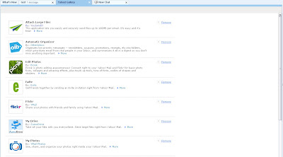
Also, when it comes to interface personalization, Yahoo has very limited option. You only get to choose the color but not the background or templates. It's easy to remove the modules but hard to find them back. Trying to explore the features Yahoo Mail provide is hard. It takes time to understand some of the features/buttons on a page. Sometimes it's even harder to re-apply what was there earlier(remove something and put it back again). I would say they did not do a good job in tip providing or interface navigation. One thing add to the personalization effort user has to put is the repeatedly password input requirement in some option tuning. As I don't see the security necessary on this but it will most likely drive user crazy.
Also, when it comes to interface personalization, Yahoo has very limited option. You only get to choose the color but not the background or templates. It's easy to remove the modules but hard to find them back. Trying to explore the features Yahoo Mail provide is hard. It takes time to understand some of the features/buttons on a page. Sometimes it's even harder to re-apply what was there earlier(remove something and put it back again). I would say they did not do a good job in tip providing or interface navigation. One thing add to the personalization effort user has to put is the repeatedly password input requirement in some option tuning. As I don't see the security necessary on this but it will most likely drive user crazy.
 How do I apply these things?
Lastly, the messy ad is always a big issue in Yahoo Mail. It can come out everywhere with little or no related information with what the user is interested in. (no user model training on the ad selection)
Best User Interface -- Gmail
Following the Worst UI design in Email System, the Best email system I want to discuss here is the Gmail.
First of all, we can see that the interface is clean and intuitive. Novice user can perform those basic mailing operations(browse mail, compose mail, read mail) easily with least amount of clicks possible. Expert user can adjust their interface fast without spending too much time on guessing where the option is placed.
Emails are listed one in a row with the title, a few words as summary, attachment notice and date. In the mailing activities, Re and Fwd is very common. Many email systems treat each of those kind of document as its own entity and list out separately based on the time received. However, to better organize email threads(a list of back and forth email among the same set of users) Gmail automatically put them together for better reference experience. This can not only shorten unnessassary mail list length but also improve the time user has to spend on finding history message. Spam detection is among the best. User rarely see spams and if you label some as spam, the system can pick up the pattern very fast. When it comes to mail composing, it provides you with handful tools and plain/advance composing environment. Some of the notification for careless user(send without the subject/attachment) is also very user friendly. As for organizing, Gmail provides the user with ImportanceDetection, Stars, Labels, Archive options for short term and long term preservation purpose. With Gmail, users can do better and faster personalization than any other email system.
Even the most tedious thing -- Ad, Gmail put effort to make it less tedious. The ads are content related. It is actually fun to see what kind of ads would pop up with each of your email.
In overall, Gmail constantly adding features to its system. They do not force every user to adopt each new feature but only if they like it. The flexibility is good and so it guarantee a good probability of user experience through both the practical aspect and aesthetic aspect.
Chiao In CHI 671
I decided to take this course because I need to strength my knowledge in UI design which is also important in my research related to community exploration in social web.
Subscribe to:
Posts (Atom)


